Website Heatmap Analysis: A Complete Guide For These Tools
Examining how users engage with your website is the first step in enhancing its functionality. The simplest method is to use heat mapping. A heatmap is a special and practical tool that uses many colors to represent sophisticated data analysis. The idea of heat mapping is not new, and it has been applied for a long time to display complicated data outside the context of interactions with websites.
However, we're just going to examine heat maps from the perspective of displaying data connected to websites in this article. It contains explanations, illustrations, advantages, and tips on how to utilize it effectively for your website.
What You Have to Know About Heatmap Tools
A heatmap displays complicated data using a color spectrum. Warm colors, such as red, orange, and yellow, are used to depict more intense or higher values in a data heatmap, while cooler colors, such as blue and green, are utilized to depict lower-intensity values.
Compared to, for instance, a chart with numbers, heat mapping software provides data in a form that is very simple to understand. Since the 19th century, grayscale shading has been employed often to represent data of varied intensities, giving rise to the idea of a heatmap.
In numerous disciplines today, including biology, mathematics, population statistics, design, marketing, finance & economics, environmental studies, and many more, heat maps are employed. Since its introduction thirty years ago, heatmap software has advanced significantly, and today it may also be used to track data for websites.
Because of how easily they may be understood, heatmaps are quite valuable. They save a ton of time since they can be quickly read and comprehended. Furthermore, a title or brief description is usually enough for laypeople to understand a heatmap.
What Data You Can Gather from Heatmaps
A website heat map may be used for a variety of purposes, including the presence of different kinds of analytical data. However, on-page data, which identifies user activity, is most frequently used to demonstrate how users interact with features on your website. Useful on-page user data includes, for instance, which UI areas have the best conversion rates, and bounce rates, which buttons get the most hits, and which portions are directing visitors to the website.
Heatmaps are frequently used to precise display which areas of the website receive more interactions and, conversely, which ones receive less since they are simple to interpret. In a heatmap example, the areas of the website with more interactions will be colored redder and more vividly, whereas the areas of the page with little to no interaction will be tinted in cooler and less intense hues, such as icy blue.

This information can be presented in a variety of ways. Hover maps, click maps, attention maps, and users scroll maps are just a few of the heatmap types that may be created. The information provided here will be very helpful in optimizing the on-page content and website design.
About the Analysis Procedure
Heatmaps are essentially compiled data from Google Analytics. This is the backend information that enables tracking of target audience behavior on the website. First, a heat chart is created using this collated data, typically using charting software resembling Microsoft Excel sheets.
The data is next transformed into a colorful gradient using software settings, which is subsequently overlaid onto the webpage. This provides a quick snapshot of user activity on your website. In order to allow you to see through the heatmap colors on your website, they are often made semi-transparent. The components of your website's color-coded representations are then readily apparent.
An image of your website will initially be taken by the heatmap maker. The code of your website will thereafter have a little JavaScript embedded in them. Every time a user opens your website, this code permits site information to be sent to the website's author. Afterward, a map of your website will be made that includes all the parts that visitors may interact with. The correlation heat map will be made using tags and parent elements, using the site data for each of these elements' interactions.
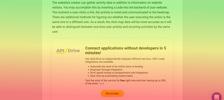
The website's creator can gather activity data in addition to information on website visitors. You may accomplish this by inserting a code into the backend of your website. The moment a user clicks a link, the activity is noted and communicated to the heatmap. There are additional methods for figuring out whether the user executing the action is the same one or a different one. As a result, the click map data will be more accurate as it will be able to distinguish between one-time user activity and recurring activities by the same user.


All of these numerically encoded data will subsequently be transformed into qualitative values, or colors. A color will be allocated to each set of integers. For instance, colors with larger value ranges will be darker or more intense, whereas colors with lower value ranges will be calming or lighter. The snapshot of your website will then have these colored maps overlaid on it in an understandable manner. Fortunately, as was already indicated, reading heat maps only requires a very brief amount of training.
The Types of Heatmaps
The data provided to mapmakers may be used to create a wide variety of heat maps. Here are a few of the most typical:
- Click heatmap;
- Scroll heatmap;
- Mouse heatmap.
Mouse heatmap
This heatmap, often known as a movement map, displays the areas of your website where visitors' cursors are left parked or hovered over frequently. Essentially, it is a map that displays mouse-tracking information. These are not click-count records. Instead, they highlight the users' purpose for visiting your page. A hover map, for instance, can show you which connected goods customers were evaluating before making a purchase or actually leaving if you run an online business.
If you're preparing a retargeting campaign as part of your customer-driven marketing strategy, this information is helpful. However, it's best to take mouse movement information with a grain of salt. This is due to the fact that an eye-tracking heat map, which is more expensive and requires extra support, may not always match the location where a user leaves their mouse pointer.
Click heatmap
This map focuses on all the links that are present on your page. It displays the URLs that have received the greatest and the least clicks. In confetti reports, where each user click is displayed separately, click maps are also frequently given. In other words, map designers have a significant influence on how clicks are presented. While others will portray it as separate dots, some may present it as a whole splotch or mass of colors.
The confetti report method is well-liked since it enables you to see where customers have clicked on your websites. Users frequently click on sections of websites that do not link, which may indicate that your link designs need to be changed or that you need to provide better link bait. This can disclose some surprises.
Scroll heatmap
Your entire website will be shown as a semi-translucent color gradient when using scroll maps. This color gradient depicts the areas of your site where visitors tend to scan the most and pause before leaving. You need the information from a scroll heat map to determine where to place the important links on your website. It also informs you of the user visibility of your present link placements.

Consider a Call To Action (CTA) button with the words "Find Out More" that is present on your page but is situated at the bottom of the page, after a few paragraphs of text. Users won't see your CTA button if it is located in a scroll map area that is blue, green, or another cool hue since they won't spend time there. You may want to think about shifting your CTA up towards the red zones depicted on scroll heatmaps.
The Advantages of Using Heatmaps
Now that you are aware of what a heat map is, you should consider both the immediate and long-term advantages it may provide for your company.
Heat maps are incredibly adaptable and can handle a wide variety of data. This implies that they can be used for different purposes:
- Heat maps are very simple to comprehend and use. Unlike charts with lots of numbers, you don't need to gaze at them for a long time. Additionally, no specialized knowledge or training is required to comprehend heatmaps.
- Heatmaps are excellent for presentations to bosses or other corporate figures of power. They provide a clear image with just a quick glance and may be used to readily support or defend marketing-related actions.
- To show complicated data and the numerous facets of user-website interaction, they may also be combined with a variety of analytics tools.
- Unexpected information about your users may be revealed via heatmaps. For instance, which of your page's non-linked parts do they click on and why.
Your team members will be able to fully utilize heat maps for specific duties, in addition to just your brand or business overall.
Marketers
Marketing professionals may use heat maps to determine whether their social media marketing strategies, for example, are yielding the expected outcomes. It's critical for marketers to understand where users are concentrating their attention on a website and if adverts or call-to-actions (CTAs) are getting the attention they require.
Designers
The user experience on your website is the responsibility of UX designers. They may utilize heat maps to evaluate whether users are having any problems with the site, whether the material is reaching the user, and whether crucial CTA buttons are placed where they ought to be.
When used in combination with usability testing and A/B experiments — a test in which two versions of a website are compared against one another for a certain conversion goal — heat map data is crucial.
Data scientists
In order to effectively influence business choices, complicated quantitative and qualitative data must be presented in a way that is both easy to understand and compelling. For a better understanding and presentation of user behavior, heat mapping transforms quantitative data into qualitative information.
Conclusion
The simplest heatmap description is that it is a method for using Google Analytics tools to illustrate important user interaction data. They fail to mention how simple and enjoyable it is to view a heatmap of your website. In an appropriate and legal method, that is, it truly is comparable to spying on your visitors. Your website's efficacy will grow thanks to this "spying," which will eventually result in greater conversion rates and sales. That is ultimately what we all aspire to.
Do you want to achieve your goals in business, career and life faster and better? Do it with ApiX-Drive – a tool that will remove a significant part of the routine from workflows and free up additional time to achieve your goals. Test the capabilities of Apix-Drive for free – see for yourself the effectiveness of the tool.

